What Is Responsive Design?
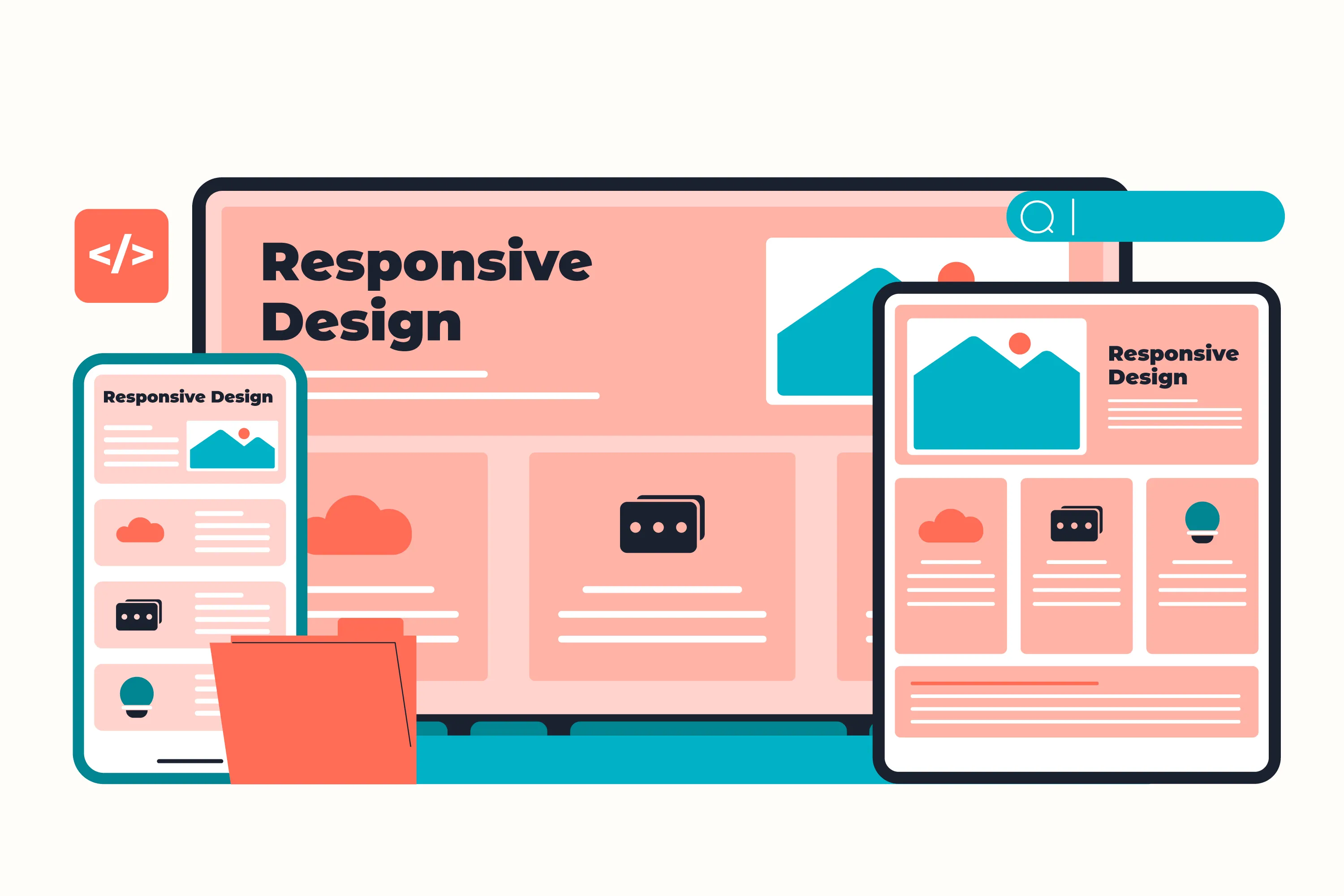
Responsive web design is an approach that allows websites to adapt smoothly across different screen sizes and devices.
Instead of creating separate desktop and mobile websites, responsive layouts automatically adjust content, spacing, images, and navigation based on the user’s screen size.
Mobile Users Are Increasing
A large percentage of internet traffic now comes from mobile devices. Users expect websites to load quickly and function properly on smartphones and tablets.
If a website is difficult to use on mobile, visitors often leave immediately — which increases bounce rates and reduces engagement.
Better User Experience
Responsive websites improve readability, navigation, accessibility, and overall usability.
A good responsive experience includes:
- Readable typography
- Flexible layouts
- Touch-friendly navigation
- Optimized spacing
- Responsive images
SEO Benefits
Search engines like Google prioritize mobile-friendly websites in search rankings.
Responsive design helps improve:
- Mobile usability
- Core Web Vitals
- Page speed
- User engagement
- Search visibility
Performance Optimization
Responsive websites should also be optimized for performance.
Modern front-end development focuses on:
- Optimized images
- Efficient CSS and JavaScript
- Lazy loading
- Fast rendering
- Smooth animations
Final Thoughts
Responsive design plays a major role in creating modern digital experiences. A website should feel consistent, intuitive, and visually refined across every screen size.
Whether you are building a portfolio, business website, or landing page, responsive design is essential for usability, performance, and long-term success.